
Anita Latte
-
Posts
5,726 -
Joined
Content Type
Forums
Store
Blogs
Downloads
Events
Gallery
Posts posted by Anita Latte
-
-
Old Navy online seems to have colors that look the same but, have different names. Kind of confusing to a newbir "Fire" gal who's looking for "for sure" matches :)
I was curious when I looked online at Old Navy for the exact color names of the tees I got, so I put in the style numbers and this is what I found:
This is MUCH brighter in person: http://oldnavy.gap.com/browse/product.do?pid=771952022&userSearchText=771952022&searchCID=26519&vid=1 Online this looks like a perfect Earth color :D IF it is brighter IRL, then it's fire. Remember that color is a spectrum, and somewhere along the line, there is that changeover from muted to bright. There are "borderline" colors as you approach that crossing line... If this is one of those borderline colors, then it probably looks brighter when paired with your tried and true fire colors, but it probably could look less bright if I were to pair it with my earthy colors. There is nothing wrong with having items like this... one of the keys to understanding the whole color scheming is to understand HOW and WHEN you can bend the rules. This might be one of those type of items.
the green is called "clean green": http://oldnavy.gap.com/browse/product.do?pid=771878002&userSearchText=771878002&searchCID=26519&vid=1 I think this might be too cool for fire. I look at it and think it looks a bit frosty not firy... it's a bit blue... if IRL it has that granny apple green look? then it's a good fire green, BUT if it DOES have that blue undertone that I see online...then it is ice.
the blue is called "bluest eye": http://oldnavy.gap.com/browse/product.do?pid=771878002&userSearchText=771878002&searchCID=26519&vid=1 Already discussed...
the aqua is called "aquatic park": http://oldnavy.gap.com/browse/product.do?pid=771874142&userSearchText=771874142&searchCID=26519 This COULD be fire. If you look at IRL and think of the Carribean? Then it's fire. If it makes you think of walking on a glacier? or sherbet? Then it's ice.
the pale green is called "plantain" : http://oldnavy.gap.com/browse/product.do?searchCID=26519&vid=1&pid=771872&scid=771872302 This is NOT fire. It's hard to think that about yellow, but this yellow has a very green undertone to it, not the sunny kind of yellow that you need as a FIRE. Back on the season thread, Member123 and another FIRE were wearing a similar yellow and Curt explained more about yellow there...hmmm I think somewhere in the 60s pages?
I'm becoming obsessed I think, is this normal? :eek:
Like Member123 said...obsession is completely normal... I think that we all go through the phases of obsessing over all the color information, especially in the beginning when we all want to completely redo our wardrobes and want to train our eyes. I think that once you feel like you "get it", it isn't so much of an obsession (taking up so much of your time) as it is just a tool that you use regularly. If that makes sense.
I made comments on the way I see the colors above... Since Terri was actually in the store, her comments would probably be more relevant...
-
Terry...I remember for sure that the far left dress is Gianni Bini. I got them all off the Dillards web site.
Joby...The blues are really really similar. It's just a slight variation between the dresses with no black and the dresses with black. There is so much that can affect the color from the photography, lighting, the camera settings, our monitors, etc. On my monitor, the dresses with black have a very slight purple-ish tinge to them, which is the give-a-way for the ICE version of royal blue. So I was calling the no black dresses FIRE and the black dresses ICE. IRL this could be a totally different story...and please keep in mind all these differences when you look at the photos...what you see could be different than what I see...
One thing to keep in mind with all this talk about color... technically speaking, there can be a clear, muted, warm, cool version of every color. We interpret whether a color is considered clear or muted, warm or cool, largely by comparison. You can usually find something that is "more warm" or "more cool". I have some bluish greens that can look "cooler" than my yellow greens. Then I can find a cooler blue-green and my blue-green will look "warmer".
The keys then to identifying whether or not your color is right for you are two-fold... First, you have to really get to know what you look like when you are wearing a complementary color... know what happens to your skin tone... what happens to how your eyes pop... Second, seek to blend a questionable color in with identified colors. This is the help of the color cards... You don't try to actually match the color perfectly, so much as you attempt to see if the questionable color blends into your color party...
In additional to using the cards... You can do this concept at home with the cards and with winners from your closet. Make a color party on your bed... You can do this by grabbing colors that you are confident in identifying and making a color party at the store... grab appropriate neutrals and accessories... this season, you should be able to find camel, cream, any warm brown (not too dark), grab brown shoes, gold shoes, bronze shoes, the same in jewelry, scarves, whatever... does the item GO? If you need to, you can do the same for ice, grab black, white, silver and see if the color goes better over there...
-
OK, now to this post.
I can see where the 2 middle deep blues are on my new color cards. But, I do have a question--what is the difference between a Fire blue and an Ice (Royal) blue? I understand one is warm and one is cool but, I'm not sure I can see it with my eye!
Now, the purples--I would have called the darker purple an Air color. I can see where the 2nd purple is much warmer and could match the purple on the Fire cards.
I can't seem to fathom that purples and blues could be warm. I LOVE both colors but, don't seem to know the difference.
These are all bright clear blue. On my screen, the first two dresses are warm, FIRE blues and the left two dresses are cool, ICE blues. Whenever I find a royal ice blue, it always has a bit of a purple tinge to it when you hold it up to a warm blue.
Remember, doing this on the computer is really, REALLY hard. Different monitors see things differently. You might not see these as I am seeing them, which makes all of this very difficult...
One of the best tests for the royal blues is to hit the shoe department and match either gold or silver shoes. One will definitely look better... if it's the gold shoe, then it's warm, and if it's the silver shoe, then it's cool.
-
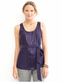
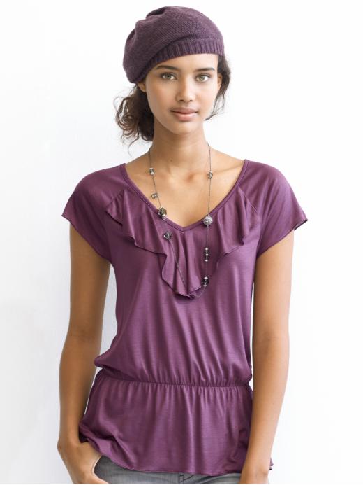
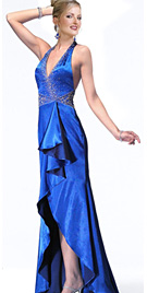
Check these out. The first one is definitely AIR. Depending on what the second one looked like IRL, it could be either AIR or EARTH. Both the first and second are muted. The other is clear, bright warm purple, FIRE.
-
Anita Latte,
if I saw either of these in the store, I'm not sure I would know that either were Fire. I would have called the dress Ice and it does look clear to me, and the shirt I would have called Air:eek:--it looks blended not clear.
Now on to your other post.
The dress IS ice. The shirt is fire though. Sometimes, the knit fabrics, which can be so dull (sweaters especially) can make identifying clear/muted more difficult.
-
Juby, I hope you don't think that I have hy-jacked your thread here by doing what I am doing. I searched far and wide for an ICE blue. I was reduced to looking at evening gowns... I finally found one. The left blue is ICE and the right blue is FIRE. Anyway, in looking at the two blues above, perhaps you can see that both are clear blues, but the left blue is absolutely cold by comparison to the right blue. It's weird to think of blue as being "hot" or having any warmth... but it can...
It will take a while to train your eye. Comparison and making color families will really help. It's why having the big flop out color cards are helpful. Once your eye gets used to the idea, you can see if the color really "goes" or not. HTH!
-
When I was having my colors analyzed, Curt needed to me to find some true FIRE blues. He helped me to identify them by using the Express website, because he was familiar with the merchandise there. I'm basing these pictures on what I learned from Curt. These are from Express.
Basically, when you look at Fire colors, they almost hurt your eyes. It's ALMOST like you feel like you need sunglasses to keep on looking at the color. Fire is such a good terminology, because they really do look more "hot" than "cool". If you look at the top picture all by itself, you see that it is a blue color, but compared to the second picture, it almost looks greenish... but it is blue.
I think sometimes it is easier to see the comparisons, I'll see if I can find some Ice ones so that you can see the differences in the color parties. Your monitor may vary, but on mine, these are all Fire colors ranging through the blues and purples. If Curt has a free minute, maybe he could verify...


Stores that carry "FIRE" season clothing
in Cruise Fashions & Beauty
Posted
The crazy thing about color is that technically, there could be a version of every single color that would be appropriate for every palette...
So if we want to talk about "pale green" (which just doesn't work AT ALL in concept when thinking about FIRE, but I understand that you are meaning a lighter color of green, or a green that is less saturated...), it exists, so long as it is warm and clear...
I can't help myself... I shop for my Mom whenever I shop for myself. Just because it can be so hard to find the right colors. A FIRE GREEN other than granny apple green is really hard to find. This particular color, called "plaintain", which is the name of a fruit related to bananas, which are generally yellow, is reading as a yellow color on my monitor, with a green undertone.
You would have to take a picture of this one, because as I said before, both my Mom and the other fire lady that wore greenish looking yellows were told they were wearing the wrong yellow... But the camera will not lie. I know you saw the recent pictures on the Season thread... the Fire lady is wearing that cold bright blue and it wrecked havoc on her skin tone... when in doubt... take a picture... know your store's return policy, or take a digital camera with you, or use your phone if applicable... take a picture of yourself in a known color in the store and compare that with a picture with the questionable color. The lighting will be consistent in the pictures so you can do a fair comparison on what happens to how you look with the two colors. If the questionable color makes you look the same in the photo as the known color, then it's a good color. If the camera tries to do some sort of weird compensation and the picture looks wacked, then it's a bad color...
You really need your pale green to read more like this does on my monitor...
The left on the left for the last picture. In a way, you could call all these colors a version of granny apple green... I think that the point is though, that if you are looking for a pale green, it needs to read like green with a yellow undertone and NOT yellow with a green undertone, which sounds ridiculous even as I type, but seems to be the truth...
I have found this to be true in general...
like blue... if it is a BLUE color and leaning toward the violet end of the spectrum, it looks cooler than if it approaches the green end of the spectrum...
green... if it is GREEN will look cooler the more it leans toward the blue end of the spectrum and warmer toward the yellow end...
yellow... if it is YELLOW will look cooler toward the green end of the spectrum and warmer toward the RED end...with most oranges being warm...
red... if it is RED will look cooler toward the blue/violet end of the spectrum and warmer toward the yellow/orange
violet... if it is VIOLET will look cooler toward the blue end of the spectrum and warmer toward the red...
Do you remember the blue-green crayons versus the green-blue crayons? red-violet versus violet-red? They were totally different colors with one being more warm or cool than the other. This is relating to the undertone of the color itself. If you remember seeing my post on green on the seasons thread, I made a collage out of all my different greens. When they were all together, they no longer looked green, they looked yellow, blue, gray... you look at the picture and you'd have a hard time saying, look at that green shirt... you HAVE to start differentiating the green... olive green, forest green, army green, avocado green, yellow green, gray green...etc.
Ever try to pick out a "tan" colored paint? You get all those paint chips home and they look pink, yellow, reddish, whatever... they certainly don't look "tan" any longer...
But this is the point of your skin as well... you are "flesh colored"... we all are... but you have a "warm undertone"... so you need to find the colors that have that "warm undertone" to match your skin... every color will work, so long as you find one with the same undertone you are.
The added element to that equation is the clear v. muted colors. Because of your skin type, you also need clear colors and that is what differentiates your warm undertoned skin from an earth person's skin. Wow. I talk a lot. I HTH!! I think this is all very interesting so I like to talk about it...please forgive me if I talk too much...