

Member123
-
Posts
1,864 -
Joined
Content Type
Forums
Store
Blogs
Downloads
Events
Gallery
Posts posted by Member123
-
-
Here is the collage edited for removing the AIR greens and the retakes:

Voting on the BEST: A2, B1, C3
BETTER: A1, A3
GOOD: B2, C1
Anita, I would really like to see a collage with the images ordered like I have listed... with the BEST in the top row, BETTER in the middle row, and GOOD in the last row.
I would also like to see the infamous found laundry items to see if I would change my mind about all of those tops.
And, I think that I'm pretty secure in my opinion(s).
But, I really, really want to know what Kim and Debbie think as their final picks. And, also, how Anita responds to what we've seen and her opinion as to why some of the colors seemed to not work as well as others and what she would choose as her BEST color, as well.
OMG!!! Again with the posting at the same time! I'll go read Anita's post. This is getting ridiculously weird!
-
Ok. I am soooo indecisive when it comes to this stuff!
I KNOW B-3 and C-4 are out, because... well, a little birdy told me.
Yep, Debbie, I think we're in agreement on this.
A-1 and C-2 are AIR, maybe?Did you make a typo here? Did you mean A-1? Because your statement is that you LOVE (in caps) A-1 so I'm thinking you don't mean A-1 in this statement?
C-2... could be cool... could be that the color isn't "muted" enough for Anita. I don't know if it's a temperature of the color problem or if it's a muted, saturated color problem.
I LOVE A-1, A-2, B-1. Maybe C-1. I'm too indecisive.So if B-1 is good, B-2 should be also, because I even questioned if these were the same top, remember? But I can't figure out why the tops are so similar in color and yet one shows Anita in the dark, unless it is sun out and sun behind a cloud, maybe? OR, is there something I'm not seeing? See there's that indecisiveness again!
Same issue with C-1 and C-3. I like C-1 and C-3 is similar in color, yet Anita is "dark" again. What's up with that?
Like I said earlier, I have more questions than answers, so I've been checking back over and over today to see what others think. Looking at the Happy Color Party, I would think everything but B-3 and C-4 would work. Is it just different degrees of good, better, best, then?
If so, I vote A-1 as #1 and B-1 as #2 or maybe A-2 as #2. See????? --Debbie
OK. So, what is keeping you from being decisive is that now you're trying to look at the color(s) rather than the affect of the color(s) on Anita's skin tone.
So, your logic pattern goes like this:
I like B1
B1 is similar to B2
If I like B1
then I must like B2...
and the affect of the color(s) doesn't work that way. These colors are similar, but they aren't EXACT. So, just because you see a color that seems to be similar doesn't mean that you will like it as much... because the differences in the color (even if the color difference is very subtle) could be the difference between working or not working... between best, better, good... etc.
So, just look at the affect of the color... not the color itself, to try to determine whether you think the color is a good wardrobe addition or should be a subtraction.
This is just my opinion, of course.
-
Well, here's my vote:
Wardrobe malfunction for A4, B3, B4, C2, C4.
Reason: I do not like the affect that these colors have on your skin tone.
Analysis: ???
Here's where I don't really know why. I think that we'll have to have more discussion when Debbie and Kim vote. Debbie has already voted against B3 and C4 and her reasoning is that the colors are actually a temperature problem; i.e., those greens are cool. So, the only consensus we have, so far, are Debbie and me being in agreement on the B3 and C4 tops. I could be persuaded that those greens are cool, as well.
So, moving along to the Best of the Rest. This is actually a little more difficult for me.
Anita, the collage pictures were too small for me. I had to pull them onto my computer and then open up the collage in a software program that would allow me to increase the size by 200%.
I'm going to have to grab that edited collage... because I think those are definitely EARTH colors and you look fabulous in all the pictures... I'll have to increase the size so I can look closely and then vote on my FAVs.
Edit: Ok, I had edit time again. Weird that I keep posting at the same time as Anita! Anyway, I believe that the methodology that you describe for picking out the BEST would work really well. And, I would add that when we get to that point, I think it would be great fun to accessorize the best pictures and see what would really work with the color family that we're analyzing... what do you think? Just elevate this fun to another level?
Where, oh where, are Kim and Debbie? Oh, where oh where can they be? Where or where have Kim and Debbie gone? Oh, where oh where are they?
"sung to the little dog song"....
And, sorry dudette, but I think we need to see the "found" green top that is different and might be in the running for the best of the best. I'm just saying....
-
These are miscellaneous colors or ones I forgot to add to the correct group.
The camel coat that is hanging alone is the same one that is in the 3 coat picture! Shows my photographic skills, doesn't it :o The small jacket along the bottom is a much richer brown too.
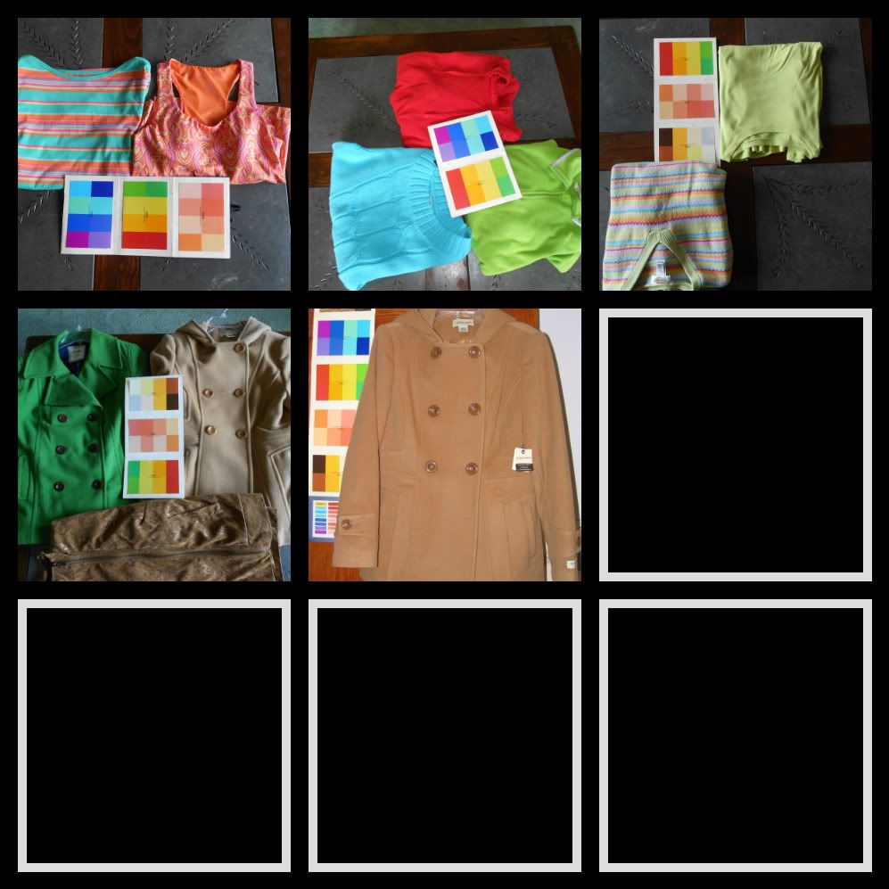
Top Row, 2nd collage picture. Is this the forgotten fleece? That looks like a great FIRE color, but I'm wondering about the trim... except that it might not have a strong influence... so I agree that it would be interesting to see that one.
Also, Top Row, 3rd collage picture. Now, THAT color looks more, to me, like the color that I'm questioning on Anita's collage greens. That would be interesting to see in your collage, Kim.
So, I'm adding these two requests to my choices.
How are we doing?
OMG. I am so busy today, but I know that I'll be back here all day long to see what's going on! It's like reading a suspense novel... even though you know you should be doing laundry or cleaning the house, you're just curled up in the big, comfy chair enjoying the heck out of reading... guilty pleasure....
... but I DO have to get dressed for Zumba. Bye, bye for now....
-
Here is my green party. I can already see some that need to go to the "play clothes" pile! I await your comments oh most honored color pals.
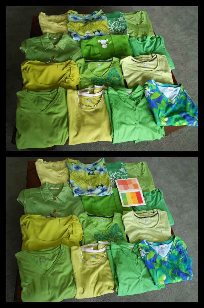
OK. Using this Green Color party, right? Did I get the right one?
Top row... A1, A2, A3, A4
Second row... B1, B2, B3
Third row... C1, C2, C3
Fourth row... D1, D2, D3, D4
So, the goal is to pick out 4 that we would definitely like to see, right? Should we give our reasons? I want to see B2 (because it looks like it's really close to one of my greens and I want to see how we compare!).
You know, the prints are not "feeling" green to me... they feel more like they would be happier at a Blue Color Party. IDK....
Here are my choices, for sure, for the collage: A4, B2, B3, D1
Now, I'm going to go back and read Anita's and see if I can figure out what the heck she's saying with coffee in my body instead of wine! ;)
Yeah, I still had some Edit time... so since I didn't read Anita's request post.. I didn't realize that we could pick more than 4 choices. I still think that I gave my TOP 4 choices, but I didn't see the "forgotten fleece" green. So, let me go back and review. I may see some more requests... I'll get back here this afternoon for sure!
-
Kasi,
Mariner of the Seas is a newer ship to Voyager of the Seas.
I was on Voyager earlier this year. It seems like forever ago! But, I can tell you that the very slight changes that were made between the two ships will make you feel at home at the same time that it will make you feel like you've entered the lap of luxury.
You will love the gym. And the jogging track on the top deck is just wonderful to walk/or jog around, especially in the morning or on sea days. I don't know if the Captain of the Mariner is the same while she's in the Med as when she's here in the States... but, if so, he is quite a character. You will see him roaming around and chatting with passengers. I think they do a good job of welcoming back past passengers...
You are in for a world of fun! and relaxation! What books are you bringing to read? Anita and I will be on the Mariner in just about 6 months time! Yeah! Take good care of her for us...
We are finally, finally breaking out of triple digits heat. We're at 99 F, and it feels so much better. It's still too hot to think about doing anything with high activity levels outside... heavy pruning in the garden is still just a sweat production mess. But, it just feels so much better to move around in the outside air.
Your DH will be in Chicago?!? Wish we were closer so we could welcome him to the States....
-
Wow....
I think I've had too much wine to follow Anita's bingo.
So...
I think that I'll call it a night. LOL.
Kim! I can't believe how different our wardrobe colors are. I can just tell by looking at your color parties that we have chosen very different expressions of our colors. This is going to be so interesting!
Tomorrow is a busy day for me. Zumba in the morning. Then I have to go shopping... because... believe me... it is very unsettling to have absolutely nothing in your freezer and only one jar of peanut butter and one jar of jam in your frig. It feels very, very strange!
So I do have that to do. I should have gone to the store tonight and, at least, purchased some milk. But I just wanted to get home as there was a storm rolling in and I just couldn't face getting out of the car in all that wind... plus... just tired.
So I might get to my pictures... and I might just put it off for a bit and look at Anita's pictures and then wait for Kim's. But, I actually think the more, the merrier... especially since I know that my greens are so very different from Kim's greens! And I didn't think that would actually be the case. But, you know, there is just such a range between the extremes of the colors on the color cards. If you think about it. There are a LOT of colors between the Medium Yellow Green and Bright Warm Yellow Green of the FIRE colors.
Too, too fun. :D
-
Gotta run to my grilling class tonight. It's the last one in the 3-part Bobby Flay series. OMG. Tonight is going to be good! Chili Cheeseburger sliders, Grilled Peaches with creme fraiche, Grilled Potato Salad! But... I digress....
There is "something," "something" going on with those redo picture tops. I can't quite figure it out. I'll come back and depending on the time that I have I'll see if I can ponder those a bit more and express some opinions.
This IS fun.
-
Anita,
I would like to see A4... B4... and C2... on a do over.
I think that B3... C4... are persona non grata at your color party. RSVP Regret that they will not be attending future color parties. ;)
-
I definitely have my FAVs, but I'm going to have to look a bit closer before I can comment.
I'm taking an intermission from my service repair. So, I just took a quick look to see if there were any pictures... and... SCORE. But, again, I need to look more closely to make appropriate comments.
But, just to say.... great job! Not too many pictures at all.
-
Of course, Kim. I hope you didn't think I was discouraging you from posting your color party pictures because I didn't mean it that way.
Just checking in to see if there are any pictures available. Waiting... and waiting...
Decided to wear green today! LOL.
-
Oh man.... life totally got in my way today.
So, I have a frig/freezer combo unit with two compressors. How could they both fail at the same time? I finally ran most of my freezer items over to a friend's freezer. But lost all the non-meat freezer items: all the sauces and stock bases and ice cream. And the frig quit as well. So I lost all the food in the frig. Man, that was tough... I made the BEST pork spareribs yesterday... and had to throw out all the leftovers.
Hopefully, the service techs can fit us into their schedule tomorrow. But, we had to get take out for food tonight and we'll be having to go out for breakfast tomorrow. So, bummer... it's weird how such an aggravating thing can just dominate your day!
It may be a little while before I can get into taking some pictures.
Kim, I think that the color party pictures will pretty much just tell us whether it looks like there's a particular color that might not be part of the mixture. But, I think that pictures, pictures, pictures are going to be what does the trick. So don't think twice about it. Good grief, I must have... well... I went into my closet and counted... I have 9 different greens. How did I get all those greens? We're just going to have to grit our teeth and get the pictures done... no matter how many it takes. ... we'll just all have to get over the trepidation and do the postings. Just think how much fun everyone will have when we do this effort. I know that my agony of posting will be rewarded by seeing your pictures and Debbie's pictures and Anita's pictures. So, it'll be worth it.
And the opinions and comments will be worth it....
But, for me, it's going to be a few days at least before life will settle down and allow me to concentrate on this... at least I think that's what is going to happen in the next few days.
-
OOps... THERE SHE IS..
I think we were typing at the same time. So, "what she said." LOL
-
Debbie,
Anita will come on here and talk about shoes if she sees this post today. Her weekends are so packed with family activities... tennis, etc... and if I remember there's some sort of special tournament or tennis involvement that GS is in today... so it might be a while before she gets onto the board.
Given that I think you're trying to get to a class tomorrow, I'll just chime in here with what I know...
What kind of feet issues are you talking about?
For me, because of the changes in direction that occur in a Zumba class... think grapevine to the left, grapevine to the right, a step squat to the left, step squat to the right, etc., I had some knee issues flair up when I tried to do Zumba in regular Asics cross-trainers. It's because of the tred on the shoe, grabbing onto the floor. When you plant your foot in a cross-trainer, that shoe is designed to give you stability and so you can't really slide your foot easily in a cross-trainer.
There is a Zumba dance move called a cumbia. This dance is, theoretically, based upon movement dances that a person would do with one foot encased in a shackle... so think that one foot is very mobile but the other foot is immobilized. Because of that, the Zumba move is something that one of Anita's instructors called a "sleepy leg," so that you step with one foot and kind of drag the other foot behind you. If you are in a cross-trainer type of shoe, you cannot drag the "sleepy leg" foot behind you; you must step with both feet. You can modify the steps to accommodate the footwear that you have on... but you have to be smart enough to do that.
The best Zumba shoes have pivot points so that when you shift the weight onto the top part of your foot... onto your toe pad... you can then change direction without sticking to the floor. Go to Zappos and take a look at Ryka Transition. Look at the image for the sole pattern so you can see what I mean by a pivot point, if I haven't explained it very well.
When I first got out of my cross trainers, I tried pure dance shoes... Capezios. These shoes were not good for me, because they allowed my foot to roll. They were an immediate relief to my knee issue that was cropping up (more about that later), but there wasn't enough lateral support in the shoe to give my ankle the stability that it needed in order not to roll on me.
So, I tried the Ryka Transitions and took them off about 15 minutes into class because the knee issue flared up again on me. Thankfully, Anita was able to observe a movement that I was doing that was causing the knee joint an undue amount of stress. After she talked with me about that, the Ryka Transition shoe has been great for me. I just had a weird type of movement that I was doing with my feet...
OK. This brings me to my point. If you continue.... WHEN you continue with Zumba, my recommendation is to look for a shoe with the pivot points and lateral stability... obviously, like the Ryka Transition. For a trial class, do NOT wear really slippery soled shoes... like leather soles or stocking feet... because the risk of injury with that idea is too great... you can pull a groin or hamstring or quad with that idea... depending upon your agility, flexibility, and energy level that you exhibit in class. So for a trial class, I would recommend wearing a cross trainer and just stepping throughout the class; in other words, purposefully planting your feet rather than doing any type of slide movement(s). There are easy modifications to make if you don't have the pivot point on your shoe. I see a lot of Nike and Asics being worn in class.
And, here's the deal... depending upon your instructor and the playlist, you might not even encounter any choreography that has a slide move in it! There are some playlists where we don't do any cumbia moves, at all.
Anita can tell you about the "theory" of Zumba... some instructors really adhere to the recommendations... others... not so much. And by that, I mean things like 70% Latin music, 30% international music... or something like that. I don't know... I shouldn't probably say anything about that since I don't really remember. Anyway, the point that I'm trying to make here is that Zumba isn't a DANCE CLASS... it's still just quite a fun way to do your cardio... increase your heart rate and burn some significant calories. So, you don't have to worry about the WAY that you are dancing... whether you are moving exactly like the instructor... etc.
One of my best instructors always starts the class with his little speech... and one of the things that he says... you aren't being judged on your rhythm or lack of rhythm... breathing is highly encouraged... having a smile on your face is highly encouraged... you are not being taught how to audition for a music video... you won't be asked to perform with the Pussycat Dolls after taking a Zumba class... the goal is to have FUN...are you ready to Zumba?!?....
Hopefully, I've helped a little bit. Keep in mind that all the discussion about shoes happens after people realize that they love Zumba and are going to classes 3x, 4x, 5x a week... I don't think that you'll have to worry about having any shoe issues when you take your first class. It's kind of a feeling of ????? about what's going on and you just aren't as high-energy in your first Zumba class as you start to become as you do more and more Zumba.
-
OK. Guidelines...
I think the important thing is to do the picture in such a way that the skin tone is very easy to determine... which means that we need more of a head shot than a full body shot.
As far as dress vs top vs... whatever... I think that the important thing is to figure out the very best green, so it doesn't matter what form the green is in as long as it is near your face. So, dresses... yes... tops... yes... even exercise sports bras... yes... anything that will reflect that particular green onto your face.
And, obviously, if you have the green in your closet... then you think that it might work for you.. so include it... even, for example, an A3 type of green where you think it might/might not work.
Because... again... the goal is to vote.. express an opinion... on the very best green (or whatever color we're working with).. for you!
Yeah! This is going to be a great deal of fun. And, I hope, very educational and informative.
When Anita said that this was like having a virtual slumber party... I thought... GREAT!... we can have virtual snacks and virtual drinks... and not gain a single pound!... and have virtual late night talks... and not suffer a single lost minute of sleep! What a wonderful idea this is!
I know, Kim, it's our memories that carry us through and are the most important things we actually have in our life. I'm glad that you got to spend such precious time with your Mom and you have those everlasting, loving memories of her and your time together.
-
My next question--it looks as though this shirt has black in it also. That's one of the "cheats" that I was asking about some time ago. If a top is MOSTLY one cotem,perature, can we cheat with it? Does that one color make it a no-no? We can see this shirt overall is warm and muted but, why does it have black in it (an ICE color)?
It looks really good on Anita, not so much on Pam. It doesn't look like, to my eye, that the black color ruins the overall warm look on Anita.
It seems much the same as if I see a lovely FIRE top that has white in it.
I thought (again) that was one of the tip offs as to what season a top was! That it was either all warm or all cool. Why do manufacturers do this---is it to make us crazy?
Kim, as always I think that Anita explained this the best. She looks at fabric(s) because she does a bit of sewing. I didn't inherit the sewing gene (so I have no idea how Anita got it unless it's one of those generation-skipping gene type things).
Anyway, fashion designers and those who pick colors could care less about seasonal color analysis. It's one of those discussion topics where a LOT of people feel sort of like your DH and DS about the whole color theory and discussion. You'll hear them express themselves in words like "feeling stifled by rules and restrictions," or "creative expression being compromised," etc. And there are a fair number of people who just don't believe that there's anything to a seasonal color palette and what looks good on people. And then you'll find all those people who say things like "we change our seasons with age," "we can enhance our look by combining warm/cool", etc. All the things that CJW debunked back in the day when he was talking to us on a regular basis.
Just for FUN, I went searching for what we can expect to come into the stores next Spring, and I found the following information. My comments are inserted in italics.
It’s Fashion Week in New York and to kick it off Pantone has revealed the color palette for Spring 2012.Pantone invites us to Dance Into Spring with the Spring 2012 Fashion Color Forecast.
Pantone’s Spring 2012 Fashion Color Forecast reminds us that spring is a time of renewed energy, optimism and a promise of a brighter day. And color can help alter or sway a mood. This coming spring is a colorful palette of vivid brights (could be ICE or FIRE), soft muted tones and fun-loving pastels (could be EARTH or AIR).

Provocative Tangerine Tango, an enticing juicy orange, is a vivacious and appealing refresher to enliven anyone’s outlook this spring. Providing a jolt of energy, Solar Power radiates warmth and cheer. (At first blush you would say that Tangerine Tango would be a go-to color for FIRE.. but until we can see it, we won't know if the red that makes the tangerine is really going to send the temperature warm or cool. And, just because the wrtier of the color description for Solar Power uses the words "warmth" and "cheer," we won't know if the Solar Power color will be clear.. FIRE... or muted... EARTH.)
Fanciful Bellflower, a distinct ornamental purple, exudes uniqueness and creativity. Scintillating and sexy, Cabaret is a sensual and intense rosy-red — an excellent choice for summer clothing and cosmetics.
Sodalite Blue, a classic maritime hue, brings order and calmness to mind. Like an anchor to a ship, this dependable shade works with every color in the palette. (See what I mean?!?... working with every color in the palette?!?). Cockatoo, a tactile blue-green, is sure to make your spirits soar. This unusual hue adds a whimsical touch to the palette and will surely make a statement this spring. (I think Cockatoo might WORK for FIRE... depends upon its clarity.)
Margarita, a piquant yellow-green, lifts spirits with its refreshing and stimulating glow. Reminiscent of a blossoming garden on an early spring morning, fragrant Sweet Lilac evokes the fresh scents of summer. This delicate pinkish lilac adds a touch of romance to any wardrobe.
Natural versatile neutrals add practicality to this season’s brights. Driftwood, an adaptable blend of beige and gray with a slightly weathered feel, and Starfish, a perfect warm summer neutral, complement all colors featured in this season’s top 10.
(Here's the information that might give a clue to some patterns that we might see. And, I'll leave a detailed analysis to Anita, but I think that combining the Cockatoo, possible FIRE, with Margarita would be great and feel very Caribbean-like.. and then they throw in the Sweet Lilac which looks like AIR to me... and maybe ruin the whole effect of what could be a good pattern for us.)
For an ultra-bold vibrant look this spring, try mixing Bellflower with Tangerine Tango and Cabaret. Combine Margarita with Sweet Lilac and Cockatoo for a subtle alternative, or combine Margarita with Sweet Lilac and Driftwood for a more practical variation. Solar Power is best juxtaposed with Sodalite Blue. For a safer bet, add a natural neutral like Starfish to the mix.
(I don't know if the fashion people will use the Pantone names for the colors that are coming out... or come up with their own. But, it looks like we're going to see a possible orange and aqua in Spring to add to our closets.)
-
I will be in and out this weekend. I understand frustration about typing on an iPad. I'm on my iPhone. The screen I see to type on is about 3/4" and if I don't catch my typos as I type, it is nearly impossible to go back, correct, then get back to where I am typing. Forget it!!!
I'm in! I'm all for Anita posting here. I'm sure that her EARTH color pictures will be welcome additions. (Unless you'd rather post on the EARTH thread, Anita.)
Anita -- LOVE the new avatar!
Greens first? --Debbie
OK, Debbie. Since Kim did a kick start with greens, I think we should do greens first. So I'll be attempting to get some pictures up here asap. I know that you're out and about this weekend. As I mentioned, there are so many things I should be doing... but I'll try to make some time for this fun thing... because like Anita I think it will help with my wardrobe packing for the October cruise!
I think this is a long haul type of exercise to get to the Best of the Best answer(s).
Kim, are you happy with your green collage? Now, that the dog has had an appetizer, do you want to post some more pictures of tops/dresses that are currently in your closet? Or, are you ready for us to vote on what we've seen... in othre words, those are all your greens?
AND... I have a big question about methodology... is it better for analysis purposes to do the same type of pictures that we did for CJW? or, for this type of picture, would it be better to actually wear mascara and lipstick.... no foundation?... earrings?... or would that be distracting to try to analyze the effect of the color on the skin? I think that we're trying to see the effect on the skin?...
-
I think we should do a study in each of our wardrobes that we have at least 3 colors in. what do all of you think? Would you be willing to go to that much trouble? I'm game.
Pam, I would like to see that funny color. I have another goal in my color palette--I want to find at least 1 item in each of our colors on our cards.
It's so great have have Anita's EARTH colors too! it gives a nice comparison to the FIRE colors.
OK, Kim. You know that I'm a really logical person; actually, off the charts logical. So, here would be my proposal... but it IS a lot of work.
(1) Do a collage of the specific color. Kim has already done her green (or do you have MORE green tops?)...
(2) Pick the BEST color within that specific color family.
(3) Do the collage for another color family... and pick the BEST color within that specific color family.
(4) Do a collage of the BEST. KWIM?
And, that way, we would then identify the BEST of the BEST of our colors... or... we might find that as long as we dress in our color palette that we don't even have a BEST color... it would be interesting to see.
I'm just thinking that Debbie is probably very frustrated with her inability to comment until Monday! Poor Debbie... we know that you are with us, in spirit, if not in words! LOL.
Even though I'm Anita's Mom... and even though Anita is an EARTH.. she's still a color sister, don't you think? (color daughter in my case)... I think we'd have fun if she did a color collage with us on this thread... especially since she's being so very helpful with her comments and there aren't many people over there who have the time, right now, to get interested in this project. OR, we could have her post over there and just comment... over there... I don't really care which way it goes.. but, of course, I don't own the thread so maybe I shouldn't have a comment about that?... whatever... it's just my new opinionated persona rearing its head again... rearing its head or rearing its rear... whatever...
So, I'll work on this idea this weekend, OK? There are so many other things that I should be doing!.... Not doing those and doing this instead?... wtg! LOL.
-
Debbie,
I have that Emerald Turquoise color card so I know the color that you mean. However, it's not my favorite color... but I think that I have a very close match to it in my closet. I honestly don't know where I got this top... it's not Chico's and it's not a color that I can even remember what name it was called.
Anyway, it's an aqua with a bunch of green in it. It's kind of interesting in that I don't think it's a very CLEAR color, which is probably why it's not one of my favorites.
I already posted a picture of my very first green top, purchased with FIRE in mind. What I should do is post a picture of my latest green top purchases so you could see the difference in how I've really ramped up my CLEAR intensity! It's pretty funny. It makes those first purchases seem almost muted... and I thought there were so intense when I first purchased them... that I was really going far out on the proverbial limb.
It's interesting how much my eye has changed in seeking the colors that I think are right for me, and, more importantly, that I feel confident and good wearing. Now I understand that, when I wear the color, it doesn't come across as really loud and obnoxious... the only thing loud and obnoxious right now is my need to express my opinions. It seems that I've found my "voice," and it's tendency is to be highly opinionated and not very <ahem> soft spoken. But that's a whole different story...
When we do the aqua color... is that the one that we're doing after we exhaust this green color party?... then I'll post that top.
So, Debbie, are you up for posting a green collage? What do you think? I will if you will and if we think it would be educational.
-
We'll miss your comments, Debbie but, keep reading this weekend and get ready to post like a wild woman on Monday :D
I'm still having trouble posting tonight, are any of you?
I have more questions on Pam's and Anita's tops but, it's so slow posting tonight, I'm going to try again tomorrow. I should have plenty of time to post tomorrow, as my beloved DH has to get a routine colonoscopy tomorrow morning :( So, we'll be spending the day inside.
I'm wondering after seeing Pam and Anita's "party pictures" if anyone else would be game to post several "party pics"? It might help us weed out any odd balls in our palettes.
I would do it? Anyone else?
Kim, I think color party pictures and thoroughly analyzing a particular color grouping would be great fun. I'm willing to do it... BUT... I think that we should thoroughly examine this green party before we move forward.
So, hopefully, the boards will cooperate today and this weekend and we can get some real thoughts and opinions expressed. I'm interested in what questions you have... ALSO... are you convinced that the tops that you thought were "blue" green really do look good on you?
And what about A3? What opinions can we express about that?
On the Seasons thread, I had a question for CJW and, someone else did as well and I can remember her face and picture but not her screen name (!), along the lines of why doesn't this FIRE color look as good on me as the other colors?... I had on a coral, green, yellow. My yellow was what I would call a "sunshine" yellow and the other poster's yellow was something more like a "goldenrod" yellow. CJW came back, gently, and told us that we hadn't "nailed" the color... close but no cigar type of thing. The other poster was in EARTH and I was in ICE. So.....
my point is that it's way more difficult to try to analyze the individual color that it is to study the effect of the color and go about it that way. By studying the effect of the color... then you can educate your eye about what does/doesn't work for you... then if the color doesn't "hit the mark" and you thought that it would... you can try to figure out WHY the color doesn't work... and educate your eye that way.
So, in that spirit, let's continue this discussion with the A3..
and others where we have a difference of opinion... what do you think?
Because I get confused easily, could you put your thoughts into a list like I did previously.. from BEST to BETTER to GOOD? And the ones that you don't think work?
P.S. Hope hubby goes through his procedure easily. Just a lot of rest for today and getting the system(s) back to normal. Good thoughts going his way.
P.P.S. Would it be helpful or would it be overkill to have Debbie and me do a green collage? Obviously, I know that I could because I've already revealed my greens. I don't know if Debbie has greens or not... but.. the question remains. Would it be helpful to do some more collage pictures?
-
These may not be the best pictures, but hopefully they will help to tell a story.
Here are the greens in my closet. I just spread them out on my couch and shot a quick picture. If I had to give them more descriptive color names than "green," I would start with: Granny Smith apple green, Chico's color name Glowstick, avocado, lime (I know we usually think of lime as ICE but it's what I would call that color).

You might think that the top that is second to the last looks... well... kind of blue-ish in this array of green tops?
So I took a picture of that specific top with more of the truly yellow-based greens in my closet: the Glowstick from Chico's and the Granny Smith apple green....

So, the reason that I'm doing this is to highlight what I'm thinking... and that is "relationships." The reason that the top looks more "blue" green is just that it isn't quite as "yellow" green as the others. But, is it really and truly blue green, or does its relationship to the yellow green make it appear to be blue green?
I took what I know, for a fact, to be a blue green out of my ICE-y DH's closet. And here you go:

So, in relation to a real blue-green... the top transforms into something quite a bit different, wouldn't you say as well? In looking at the second picture, there is a harmony to the picture because... well...I think that we call the relationships a "happy color party." There is just a discordant note that is struck with these two "greens" together: actually it feels like the ICE green just zapped all the energy out of the FIRE green; it appears to have lost its healthy glow and it has taken on an almost ashen kind of cast.
Now, admittedly, the green that I have that has the most hints of blue in it.... isn't a strong undertone of that blue. But I think that these pictures do tell a "relationship" story... The silver threads in the neckline detract from the warmth of the top. CJW used this top to help with his analysis of my season, and it was one of the first FIRE tops that I purchased. It makes me laugh a bit, now, because in comparison to some of the braver purchases that I've done... the color feels a bit less clear than I would now purchase.. and like. And I thought it was so BRIGHT when I first bought it! LOL. :eek: And, I will admit to everyone, I didn't even notice the silver threads... or care that they were there!
-
Well, I'm having so much trouble trying to post. I think the CC gremlins are acting in overtime today. It told me that I blew up the database when I tried to post some images... so I'll be back in a bit.
-
OK.
Well... we have some agreement... and some disagreement...
So I went back to try to figure out the problem with A1 and, I have to admit, I like A1 :p
So, Anita, explain what you're seeing that I'm not seeing? Or, are we now in a monitor/computer/display issue? Grrrr... that's always off-putting...:(
-
OK.
Since we're having so much fun... here's what I think.
I immediately do not like A2 or A3.
I like the B's.
And, here's my methodology....
I'm not looking at the color(s) in each of the pictures. I'm just looking at the effect that the wearing of each color has on Kim's skin tone (specifically)... the skin tone is the most important. Second consideration is the hair because it's such a "crowning glory" if you will for all of us, being the second feature that has the most volume and therefore the most impact to our "look." The last feature to observe is the eyes and I think of all of our features, the eyes are the easiest for us to enhance, personally, with either eye shadow or mascara. It's not very easy to change our entire skin tone, especially in the chest and upper arms.. slightly easier with foundation, etc. to change the skin tone of the face... but, really, it's so much easier not to have to do that. It's virtually impossible to change the hair... and I'm not talking about a color touch up at the salon but the effect that clothing color choice has on the look of the hair...
So, in looking at the pictures, the first thing that I focus on is Kim's chest area. In that, all the B's are great... and A1. Now, I disregard the area under the chin... why?... because it's really in shadow to the camera's "eye." So, how does the skin tone of the face blend with the skin tone of the chest area? For me, the answer is all the B's... and A1.
So, by now, for whatever reason... I'm thinking that A2 and A3 are not right for Kim. Why? Well, I think that A2 is the wrong temperature... cool.. and I would classify that color in the AIR category. A3.. presents more of a problem... but here's what I'm leaning toward... I think that if Anita visited Kim that she would be able to take that color home... why?... because I think that the temperature is warm, but the color is one of those bright, muted colors that an EARTH can pull off... it's just not clear enough for Kim.
So, at the moment my votes are for the B's... along with A1.
It's difficult to look at the eye area because of Kim's glasses also providing a bit of shade to the camera's "eye." Her eye area looks very much like the area under her chin. So I'm not really looking at the eyes much...
but the hair... love what A1 and B3 do to Kim's hair... rich, wonderful deep tones come out...
here's my vote in order of awesomeness....
B3
A1
B1
B2
Now I'll go read what Anita says and see if we remotely agree!
Kim! What do you think of our observations? THANK YOU for doing this! I think it's extremely educational for all of us to see the effect of the colors... and I'd really like to know what everyone else thinks... I think focusing on one color like this was a super, awesome idea...
Stores that carry "FIRE" season clothing
in Cruise Fashions & Beauty
Posted
What is SO interesting to me about this collage, Kim, is that the tops that I thought that I would like the most.... I don't. There are tops that I definitely like more than others, and it's a surprise to me which ones they are. I say a surprise, because seeing them in the color party, I had an intuition of what I thought would be best, better, good... and I'm changing my mind.
Which says to me that you really, really have to try on clothes to see what effect the color has on your skin tone.. because just glancing at the color in the store isn't going to get the job done!
I've been looking at the pictures so long now that I'm getting cross-eyed. So I'm going to have to set this aside and come back. I just wanted to post so that you know that I'm thinking!
Debbie, I think you should go ahead and post your color party and get started on some galley pictures. I really have so much on my to-do list: you can't believe... plus I think that you're farther along than I am in getting organized. So, why don't you post next...